Bank of America
Navigation Simplification
Removing complexity from the all-in-one mobile banking solution
A personal project, born from my frustration of an overly complex banking application (while only holding a single credit card account). I set out to create a more streamlined structure, placing emphasis on decluttering and removing repetitive navigation.
The conflict between usability and marketing stakeholders.
Usability wants:
Simple, clear, navigation to what will suite the users needs
Sell, sell, sell
Always remind the user of more ways to buy into the company’s products
Marketing wants:
The current implementation favors marketing product options at the expense of a simpler, user-friendly layout.
Current drawbacks:
1: Multiple “Accounts” tabs
Confusion is caused by two tabs both reading “Accounts”.
I propose a simplified solution, using only one.

2: Useless “Dashboard” tab that repeats information
The second tab - “Dashboard” - repeats information found within the accounts overview. Also, the logic feels broken to press “accounts” in the lower tab group and be directed to the Dashboard rather than accounts overview (due to navigation memory).
I propose a simplified solution removing this tab and allowing customization to include this information elsewhere.

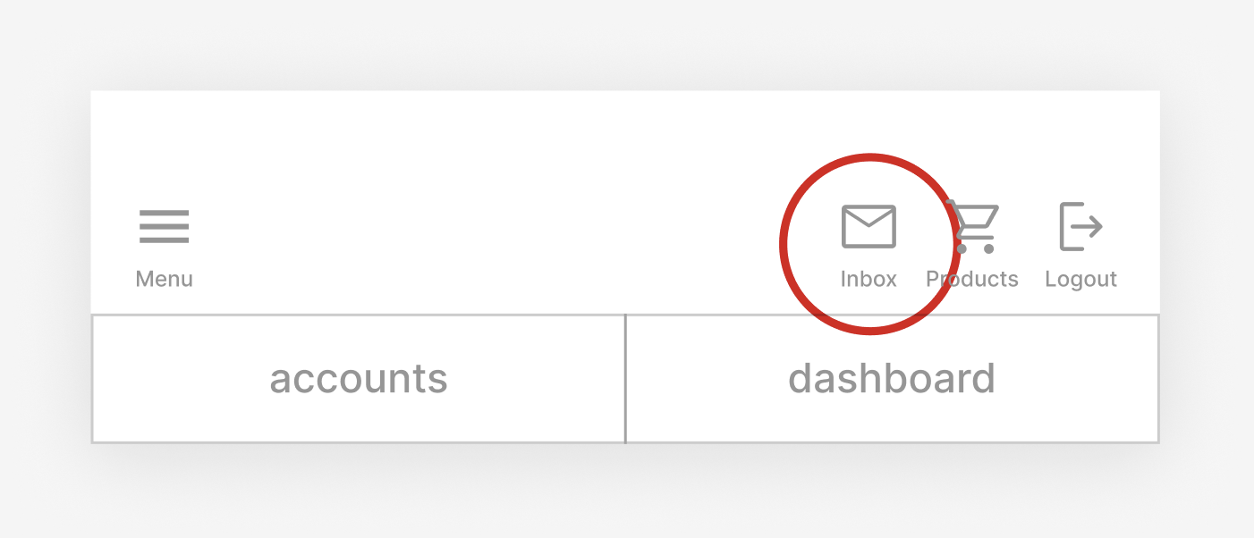
3: Notifications labeled as “inbox”
Inbox implies there will be messages within the section. Instead, it more closely resembles a Notification Center, that also contains communication settings.
I propose renaming section to “Notifications” and replacing the icon with a more properly fitting alert bell.
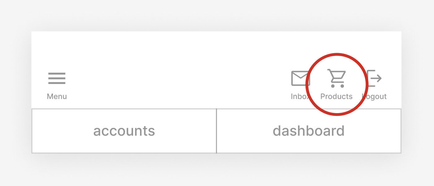
4: Unnecessary “Products” in top banner
There is obvious emphasis to present Bank of America customers with new products and offerings, but the current location misuses display real estate.
I propose removing this quick action button, and relocating it as relevant information within the main navigation pages.
Previous

Top Banner
Updated
Top Banner

Previous

Bottom Banner
Updated
Bottom Banner

Less clutter and larger touch areas make a visually lighter and more accessible navigation.
Removal of the top banner’s tabs, allows more space for the heart of the application’s information.
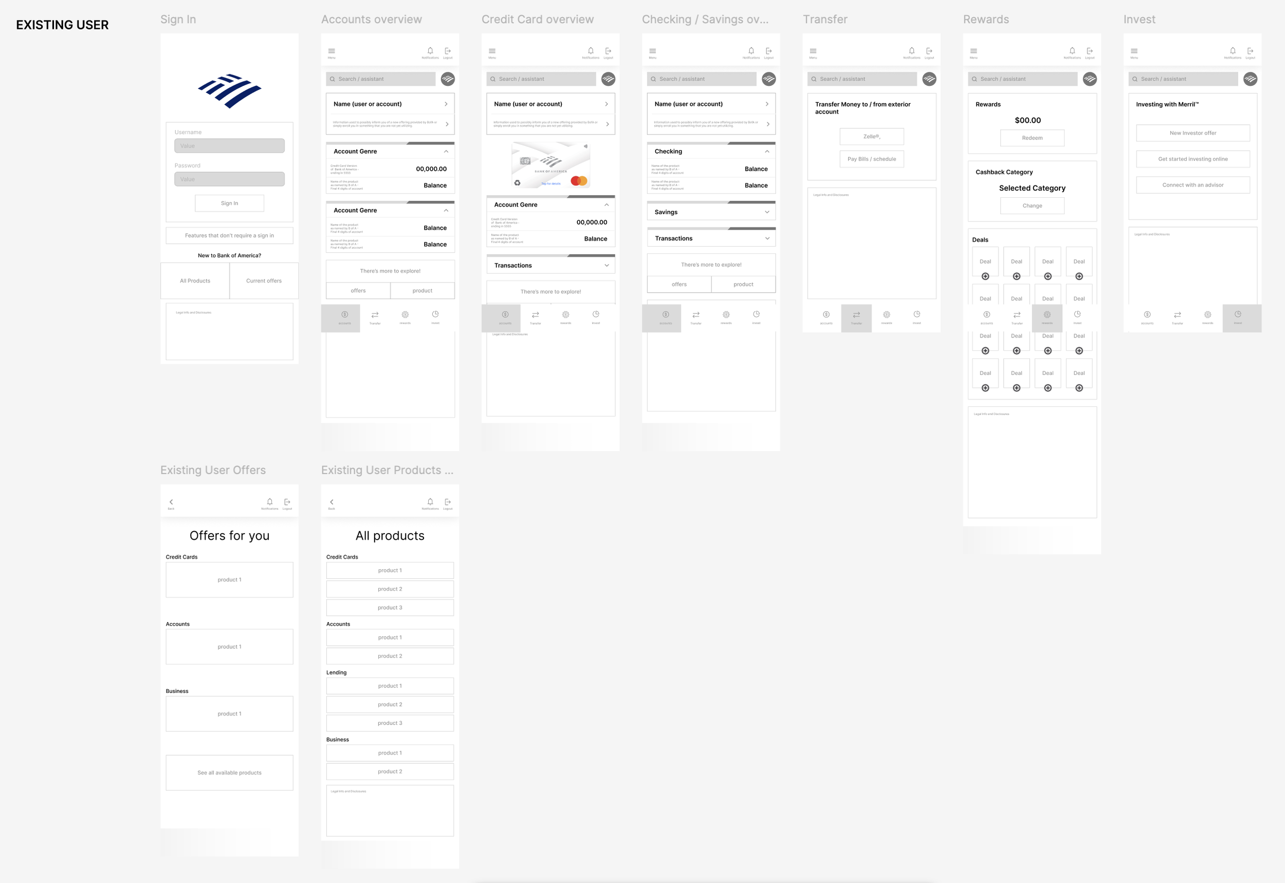
Wireframes
Using a MVP, I laid out the basic functions of the application in order to deem information as either, necessary or available for simplification.
I began with a simple new user before, diving into the greater number of options an existing user would need.
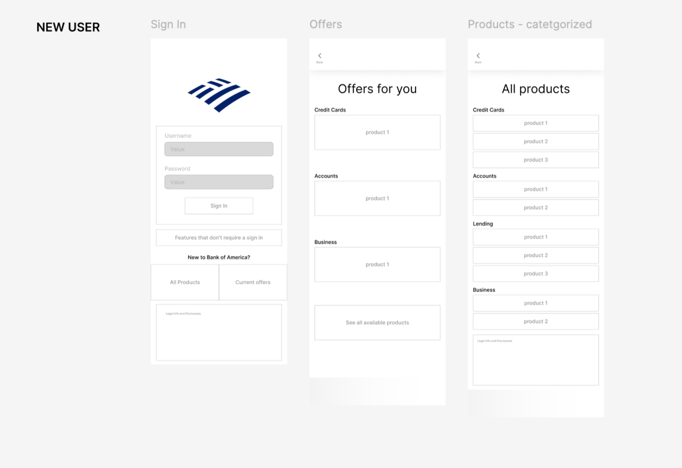
Removing the “products” icon from the top banner in favor of a card in the main information area, provides relevant products and offerings.
Previous
Updated
UI Screenshots

Once the navigation decisions were made through the MVP prototype, the cleaned up UI components were built and placed through the use of variants.


