
User Interface
(Professional Projects)
Due to the value of the intellectual property, much of my work remains confidential until public release.
Building In-Cab Experiences
In the context of the cab, primary displays are directly in front of the operator, and secondary displays are located on a pillar to the side.

source: cat.com
Design Process
-
Requirements for new UI are provided.
-
Initial concepts are made, then narrowed down to 2 or 3 options, presented in low-fidelity mockups.
-
Shared with product group, expert operators, and UX architects. A concept is selected, and any necessary revisions are made.
-
A finalized deliverable is created.
-
A presentation-ready mockup is made for sign-off and final approval.
-
GUI specification is created and double-checked. Assets are handed off.
Or Figma is marked as “ready for dev”.
Components + Graphical Elements
Machine Health Component
Visual representation of the machine’s live status:
Truck Cab + Bed individual roll angles
Necessary to avoid rollover
Green “safe zone” provided as a guideline (actually tipping point varies)
Tire Pressure Monitoring
Warn operator before a dangerous tire pressure causes an accident
Machine-Help Visuals
Using a CAD model, ensured a true-to-life representation of the componentry. A greyscale rendering style with exaggerated edges was selected for its definitive - though not distracting - appearance.
Life-like

+ Accurate Detail
- Distracting color
vs.
Greyscale

+ Accurate Detail
+ Easy to Highlight
Blue was determined to be the highlight color, due to its neutral denotation, as well as the fact that it is a highly visible color among the most common types of colorblindness. A subtle glow was added to place further emphasis.
The callout is highlighted, clearly defining a hierarchy.
15% enlarged component
Dark opacity layer to provide hierarchy

Info highlight
Greyscale image
Background
Iconography
To provide consistency within the library, sizing guides help standardize layout for each new symbol created.
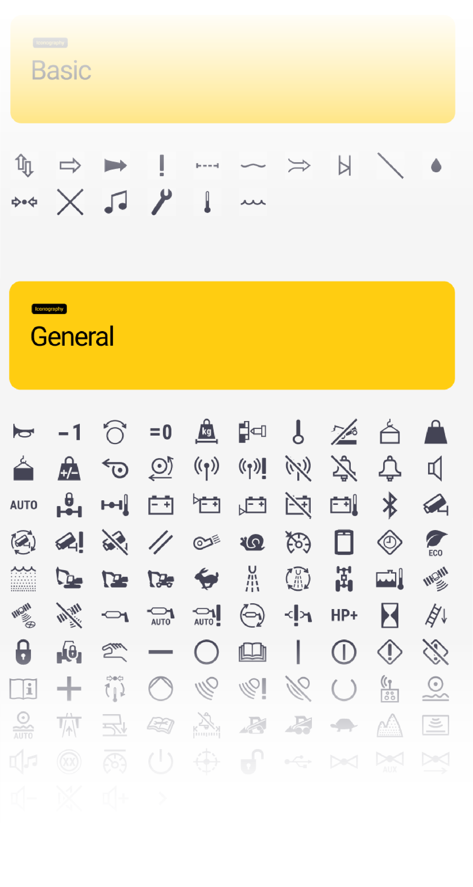
A cache of common modifiers and icon add-ons, aid in building consistent size and location among similar symbols. Minimum, as well as maximum line weight maintain a familial feel throughout the entire library.
The entire library of icons is categorized by machine, function, or use-case for easy discovery.
All new icons receive approval through safety standards, ISO requirements, + branding preferences, in order to properly represent the intended meaning.
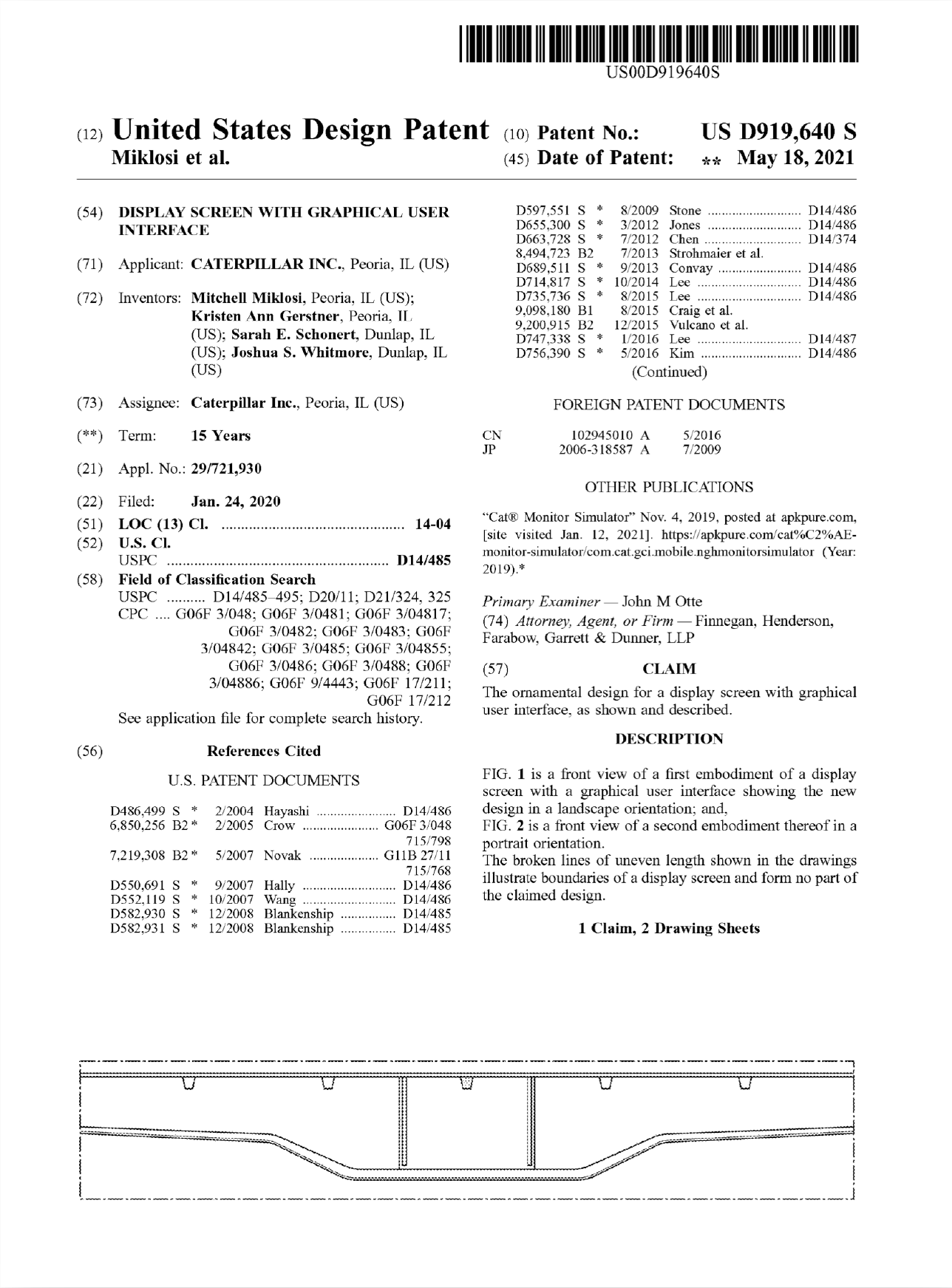
Radio Graphic Element


This graphic provides a clear indication of the audio source, while displaying the range of other available options. The design allowed for multiple methods of interaction via the touchscreen or a navigational dial.
Built into the branding element, this design has since received a patent.
Increase / Decrease Component
Using a radial design, I was able to mimic the rotation of the physical control knobs use in the cab. This unifies the physical and digital user experience. The component’s built-in buttons also provide touch capability, with generously sized touch areas.

The thoughtful construction allows for one increase/decrease component, through the use of variants, to fulfill the function of many use cases, such as temperature, fan speed, and volume controls (shown below).

Design System Setup
Typography
The in-cab displays use Roboto, an easy to access typeface, equipped with a myriad of translations - essential for the international sales of Caterpillar machines. The condensed variant, slightly narrower, aids in fitting the necessary information within the small displays without requiring truncation.

The text has 2 main objectives: to be compact, eliminating the need for excessive scrolling,+ to be legible from a distance (the displays are a reach from the operators).
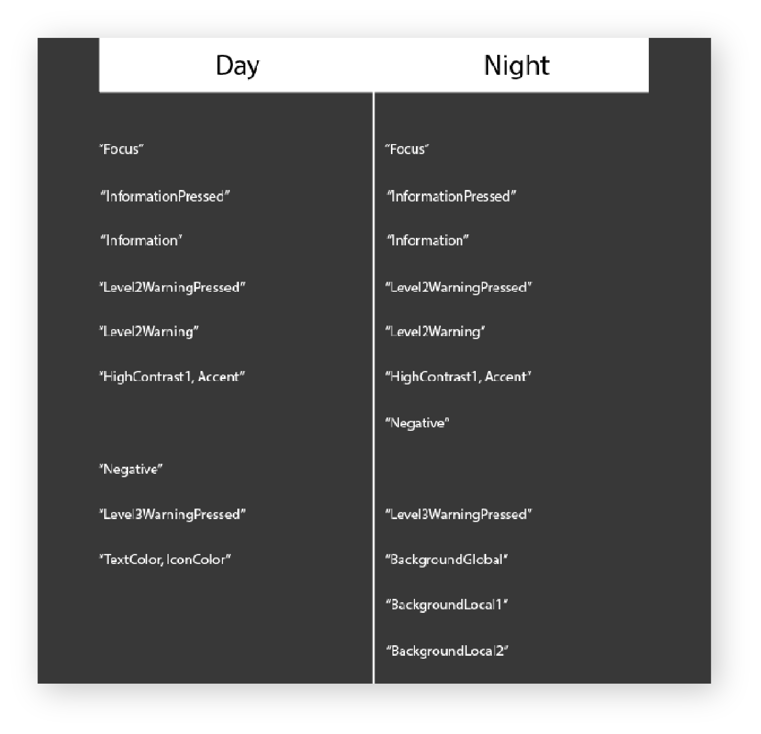
Theme Sheet Attributes
Defining the next generation of Caterpillar UI. Assigning variable names to use cases, and colors to said variables. The results provide multiple different theme variations for each single variable. This allows for altering the colors of the entire UI with one simple drop down selection.
The Importance of Color
The utility of color within a cab environment, requires a mostly subdued, non-distracting color scheme. High contrast indicators and readouts utilize color only when communicating an important message to the operator.
The operator should not be distracted by the display, since the work to be done and safety hazards are found in their surrounding environment.
Built with “read-at-a-glance” familiarity
Conceptual UI


Conceptual Trade Dress Graphics
A Chinese sub-brand of Caterpillar, was looking to revamp the company’s trade dress styling.
SEM
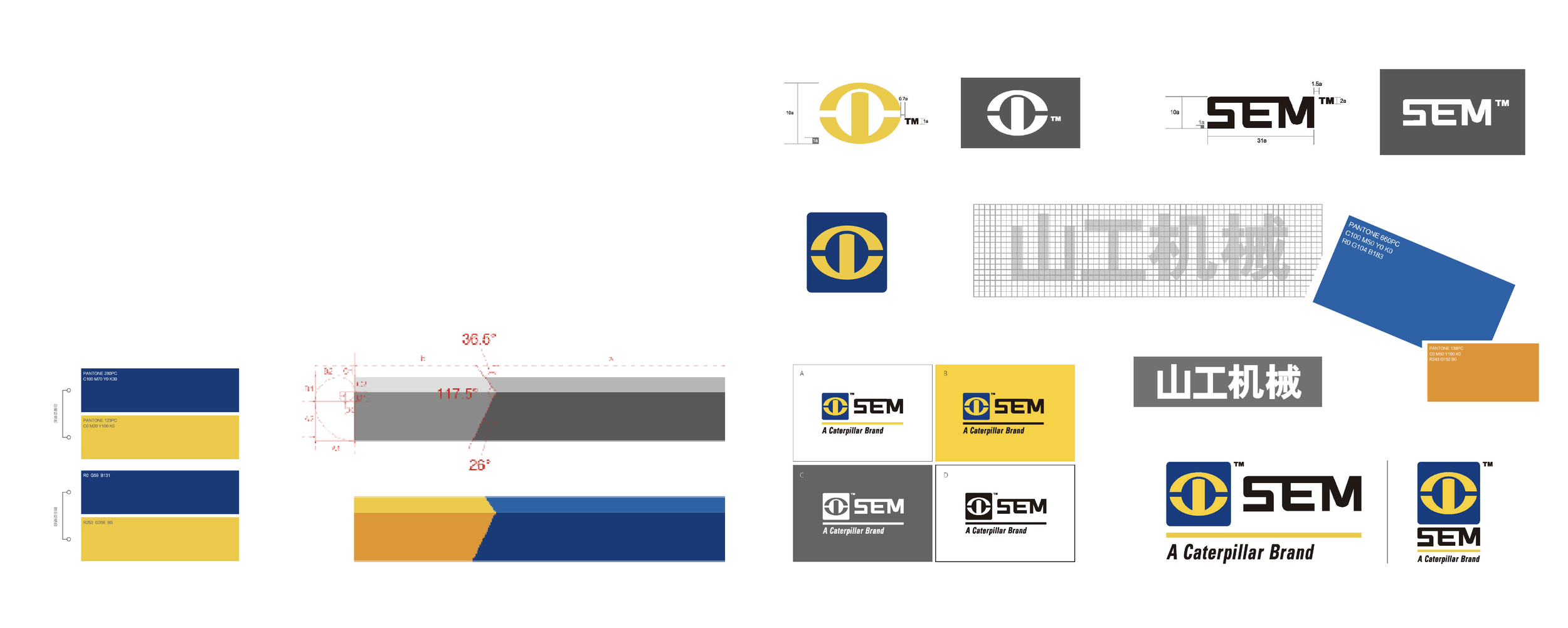
The process begins by studying the brand and its current visual identity. This includes logo usage, specific colors, and the typography that defines SEM’s brand identity.
Idea generation began using provided visual brand language to generate graphics. Included in each graphic was the company logo, company wordmark, and the specific machine model designation.
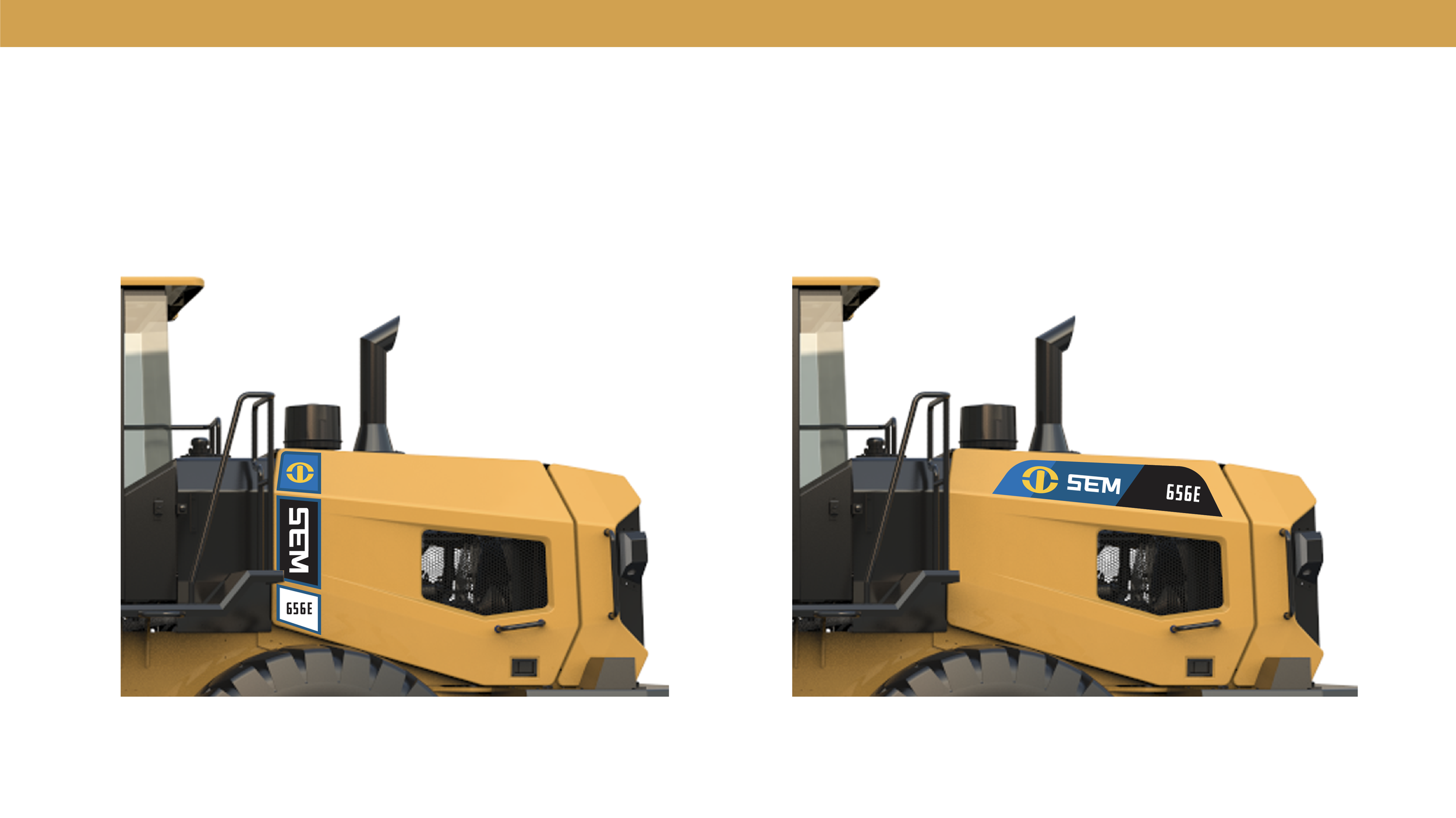
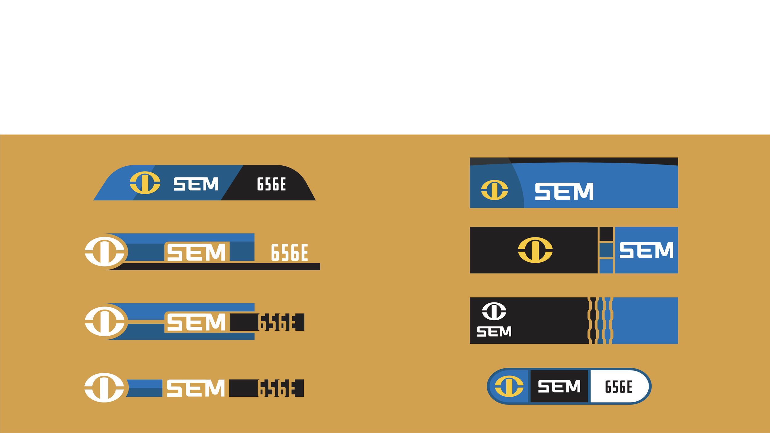
Once decal placement on the machine was considered, the overall shapes were altered to better integrate on the sheet metal.